Showing posts with label cover review. Show all posts

Tuesday, June 24, 2014

Cover Review: Micronauts #32

The cover to issue 32 of Marvel’s original Micronauts series had just about all the right elements in it to snag my attention.  First, I loved the Micronauts toys as a kid, and the comic was pretty darn good science fiction, too.  Then there is that white “snowbear.”  (I imagine in some cultures it would be a polar bear, but here the weird eyes, aura and rune-like chest symbol denote that it is something far stranger.)  And finally there is the snow against a black sky.  I am a sucker for black and white cover schemes.  They catch my eye every time.
The more observant among you may have noticed a woman’s ass jutting out at an odd angle.  Go ahead and try that pose.  It’s lovely to look at, but not so hot to hold.  That woman is known as Marionette, and she always looked damn cool in the comics.  Here the pose is strictly for eye candy, and does not speak well of her character.  Those who read the comic know what I mean.

There are certain comic book covers that I’d love to own the original artwork to so that I could hang it on my wall.  This is one of those covers.  Later in life I would swear this influenced the cover of issue 19 of the New Mutants, which was part of the demon bear saga.  Look at the covers and compare.  While not exactly the same, you can’t help but think its artist, Bill Sienkiewicz, had this Micronauts issue in mind when he painted it.  I’m not saying he ripped it off, but I believe a strong case can be made for inspiration.


Marvel put out some great covers in the early-to-mid 1980s (the Micronauts cover is from 1981) that were often the perfect marriage of art and storytelling.  You could look at the issue and know what was going on between the covers.  This issue’s cover artist, Pat Broderick, knew how to capture a potential reader’s attention and hold it, as he proves here.  I actually don’t think anyone can look at this cover and say it looks boring.  It is pure action with a good sense of style and color.  Granted, not every issue’s cover was up to this one’s high standards, but most of them in both of Marvels’ Micronauts series were appealing in one way or another.  Of course, there is the exception of that Beyonder one … but then again all of those covers associated with that crossover sucked, as did most of the issues, too.

Mandatory FTC Disclaimer: Clicking on a link may earn me some dough!

Sunday, September 16, 2012

Cover Review: Strikeforce: Morituri #22

What I'm about to write bears no judgment on Strikeforce: Morituri as a series.  It has nothing to do with the planet I live on facing some kind of meteor threat.  It has everything to do with the testicles the creature is wearing on his(?) face.

I get the idea that a comic book cover is meant to sell a story.  It's there to grab someone's attention.  It's there to entice a new reader or suck back in someone who let the series go.  Sometimes a cover will target a certain demographic.  Thirteen-year-old boys like big-chested women wearing next to nothing.  Intellectually stunted emo girls like a weepy looking guy.  What demographic, pray tell, is drawn to alien men(?) with testicles growing off their faces?  Not even the most testicle-fixated man or woman could view this cover and think, "I have to buy this."

There is nothing else about the cover that looks vaguely sexual.  There are not strange vagina-like plants.  No woman eating a banana or dribbling milk down her chin.  There isn't a man holding a log in a strange place while a boy looks on in excitement.  None of that.  Testicle Chin stands alone as the cover's high weirdness.  I wonder how many issues this sold beyond the title's core readers?  My guess is very few.

At least we should be thankful Testicle Chin wasn't starting to grow a beard.

Sunday, May 20, 2012

Cover Review: Avengers #25

Since the Avengers movie is such a hot commodity these days, I thought I'd go way back in the vault to check out the cover to issue number 25.  Those of you who only know the Avengers through the movie may be a bit puzzled by this one.  You recognize Captain America, and think that maybe that one guy with the bow is Hawkeye (it is), but who are the other two?  That's Quicksilver and Scarlet Witch, mutants, Avengers.

These four heroes are being startled by none other than the Fantastic Four menace known as ... wait for it ... Dr. Doom!  He is a total bad ass, but the Avengers' reaction is a bit peculiar.

From the way everyone is standing, it appears that the Avengers were just strolling down a street in Latvia when they encountered Doom standing dramatically.  The Avengers' reaction?  "What the --!?" And then they struck surprised poses.  Captain America even seems ready to let loose some Kirby-esque karate on Doom's metal butt.

If you were reading Marvel comics at the time, this cover, with an overuse of the color blue making everything seem calmer than it should, this issue must have seemed pretty cool.  The Avengers up against a FF villain with the FF thrown in for good measure?  Excellent!  If you weren't reading Marvel comics, though, this just had to seem kind of lame.

Dr. Doom seems like a cool figure.  All metal and green, standing undaunted before four kind of wimpy looking heroes.  It hardly seems like a cover that would grab the readers' attention and make them want to buy the book or even open it up.  The blurb says, "In this great issue," but the cover screams otherwise.

The Avengers has had far better covers.  Most of them came in the '70s.  This one probably turned away more new readers than it drew in.  It obviously didn't tank the series, though, or you wouldn't have seen the movie five times already.

Tuesday, December 27, 2011

Cover Review: Doctor Tom Brent -- Young Intern #2

Charlton put out a lot of comics I liked.  They weren't always good comics, but I enjoyed them nonetheless.  My guess, however, is that in 1963 there wasn't a single sane person who ever uttered this phrase: "Oh boy!  It's the new issue of Doctor Tom Brent -- Young Intern!"  Not a single one.

How many things can you count wrong with this cover?  Let's start with the obvious -- the title. 

Doctor Tom Brent -- Young Intern sounds about as exciting as watching Lawrence Welk on PBS with your grandmother as she starts to nod off.  There is really nothing about the title that says, "Read me."  If your parents hated you, this is the comic they bought you.  "I know you wanted Detective Comics, but you've been a little bastard.  Read this instead."  Even Ned Flanders finds this boring.

A cover's job is to sell readers on the comic.  The artists, of course, would have no control over the title or the story inside (in this case, the yawn-fest "A Doctor Heals in Many Ways"), so they had to make the artwork engaging on some level.  They have, obviously, failed here.  Instead of drawing a cover that pulls you, they decided to come up with something even more boring than the title.  One doctor at a microscope, another one telling him that they had 12 hours to come up with some way of keeping a boy from going home to die.  Our hero, Young Intern Brent, has no clue how to do this.  Way to sell a book.  The only thing that could have made it worse was a cover blurb stating, "Now with ten MORE pages of TEXT inside!!!"  What were they thinking?  Who was the audience for this?  Who bought it?  Tom Brent probably doesn't know.

I have none of these issues in my collection, and I doubt I ever will unless someone sends me the wrong item when I win something on eBay.  This series could be the most exciting young intern series ever written for all I know.  You can't tell by the cover, however.  What you can tell is that there were probably quite a few kids who spent their twelve cents elsewhere.


Monday, November 28, 2011

Cover Review: Doc Savage #7

I never read Marvel's Doc Savage series.  Covers like this one, to issue seven, is why.  It is bland, boring and bad.

The title logo is fine.  It reeks of savagery.  Everything else, though, just reeks. 

First there is the werewolf.  If it stood upright, it's head would be awfully tiny.  And why does it look like it should have four arms?  I do like the thick drool, however.  I am a big fan of thick drool.

Savage himself is ordinary.  If I knew nothing about the character or the title, I would know that Savage was oddly colored (bronze?), and liked to wear a vest, white pants, boots and little else.  He also had weird sideburns.  I would imagine he was some kind of werewolf hunter, based on what the werewolf is saying, and the fact that his name is Doc Savage. 

What is stranger than the werewolf or the odd coloring of the cover, is the werewolf's prints in the snow.  The footprints don't seem to resemble the werewolf's feet, they are drawn oddly, and it looks as if the werewolf was possibly hopping on one leg that those Oriental ghost vampire things.  Perhaps this was part of the story.  I have no idea.  I never read the issue, and with this cover I never would.

One last note: How the hell are the clouds behind the sun or moon?  (I can't really tell which it is.  It resembles the sun, but there is little reason why a werewolf would be out in the sun since they traditionally turn into their namesake during full moons.)  Has the moon/sun suddenly entered our atmosphere?  If so, this cover should look radically different.  Rick Butler, you've done better.  I'm not sure you've done worse.


Mandatory FTC Disclaimer: Clicking on a link may earn me some cash.  This issue was not sent to me to review.

Thursday, October 13, 2011

Cover Review: Bachelor Father

Nothing screams fun to a young lad or lassy like a comic cover featuring John Forsythe.  If that poor misguided child remained unconvinced, this second issue of Bachelor Father, which is reminiscent of those Mother Boy dances on Arrested Development, worked in a little more sugar to lure young readers in.

First thing you may notice is the daring use of dynamic colors.  If that didn't make it jump of the rack, nothing would.  But let's say the child was color blind and not a huge fan of Forsythe, what could publisher Dell possibly put on the cover to pull this wayward reader in?  How about a creepy singing Asian man named Sammee Tong complete in some servant-type outfit?  What about the world's most exciting musical instrument, especially when on the cover of a comic book?  Done and done!  Toss in Noreen Corcoran tickling those ivories, and you have yourself a winner.  Combined, these images cause this cover to scream "fun!"

Or not ...

Photo covers using celebs is a risky gamble.  On one hand, you have a built-in sale if any reader happens to be a fan of the celeb.  On the other hand, anyone who isn't a fan isn't likely to buy the issue.  Fans of Bachelor Father, a comedy that ended up running on all three of the major networks, may have been thrilled there was a comic of their show, but I have serious doubts anyone else cared ... despite Sammee Tong (whose very name seems racist).

I've never seen the television show, and have never read the comic.  Covers like this don't make me want to experience them, either.  One thing does have me perplexed, however.  Is Tong singing ... or is he screaming for escape?  If it's the former, I'll definitely pass, but if it's the latter ... it could be an interesting issue.

Monday, May 2, 2011

Cover Review: Texas Chainsaw Massacre #4

Being a fan of the original Texas Chainsaw Massacre movie there was really no reason for me to ever pick up the Wildstorm comic book series.  It looked horrible.  In fact, of all the covers, this is the only one that ever grabbed me.

Close-up covers usually work very well.  They force the viewer to pay attention to them.  They convey importance.  The cover to The Texas Chainsaw Massacre #4 is no exception.  It is a close-up of the upper left section of a female's face.  You see an eye, a tear and an image reflected in the eye which is causing that tear -- Leatherface holding a chainsaw.  Anyone who has seen the films know why this would cause someone to cry. 

For a cover to put across so much emotion is a rare thing, especially for a horror comic.  Subtlety does not usually sell issues.  In this case, however, the cover transcends the usual horror comic trappings and instead focuses on raw feelings.  The tear may look exaggerated, but that doesn't matter.  You understand it.  You sympathize.  You fill in the missing pieces of her face.  If every issue of this series did such a cover, it would've been worth picking up. 

On a final note, you can see that the series was suggest for "mature readers."  If a parent doesn't understand that a comic book called The Texas Chainsaw Massacre which features a man holding a chainsaw on the cover isn't for mature readers, he or she should not be a parent.


Mandatory FTC Disclaimer: Clicking on a link may earn me a small commission.  Hell, I hope it does.  I did not receive this issue to review, either.  I chose it as an example of the only good thing in a cringe-worthy looking series.

Saturday, November 20, 2010

One of My Cover Obsessions

Glowing skeletons or skeletons that were on fire have always managed to grab my attention.  This 1977 Amazing Spider-Man cover is just one example.  I loved this issue as a kid.  Dinosaur skeletons and Stegron?  Sign me the hell up.


The mid-to-late '70s covers for this series were always pretty good, but this one really stood out for me, and I wasn't a huge Spider-Man fan.


Another cover that had me grabbing the book is this one from Detective ComicsThis isn't a pure skeleton, but it is close enough.  Comparing the two shows some similar color themes and composition.  The hero, at the mercy of a fiery skeleton seems to be symbolic for the hero's death, which is always a way to catch a potential consumer's eye.  We all know it's a ploy, but you can't help but want to know what the hell is going on.


If you liked flaming skeletons, you couldn't help but be a fan of Ghost Rider.  A flaming skull.  A flaming motorcycle.  If you were male, that was damn cool.  (I imagine a few females liked it to.)  Johnny Blaze, the Ghost Rider from my youth, was motorcycle stunt rider (cool job) who turned into this flaming skull superhero (cool idea) and fought guys with like the one who had a giant eyeball for a head (not cool at all).

With Ghost Rider you no longer had to wait for your favorite cover to have a flaming skeleton character.  You got it every month in the form of Marvel's own supernatural hero.  Oddly enough, I was a huge Ghost Rider fan.

Most people remember whatever decade they got into comic books as being the best decade in the industry's history.  I got into them in the 1970s, though I would not call that the industry's best.  It was, however, the decade of some of the best freakin' covers.  These flaming skulls and skeletons are just a small part of it.  The covers were more dynamic than anything you see now even.  Don't believe it?  Look at the Ghost Rider cover to the right, and then compare it to the one from the 1990s below this.
It's a passable cover, but it lacks the dynamics of the three previous ones.  Yes, the concept is still kind of cool, but it doesn't scream, "Read me."

We'll never see an era quite like the 1970s when it comes to comic covers again.  And while the concept is still being used, it lacks the excitement these covers had decades ago.  It's a shame, too, because if these covers still had the same visual punch, perhaps there'd be more readers today.


Sunday, October 31, 2010

Cover Review: Peter Parker, The Spectacular Spider-Man #101

If you take out this comic's title, you are left with a simple, yet dynamic black and white cover that catches the eye and doesn't let go.

The covers for this series were typically full of action and usually centered on Spider-Man and whatever villain he faced that issued.  This cover goes the more artistic route, and in doing so may have attracted more glances than the other titles surrounding it on the rack at the time. 

The year was 1985, and John Byrne was the cover artist.  This is obviously before his artistry went totally south. 

If you're looking at the cover trying to figure out what doesn't look quite right, you wouldn't be alone.  At first you are taken in by the excellent lack of color, but the more you stare at it the more something seems off.  It's the buildings, and it's brilliant.

The layout of the buildings makes no rational sense.  If this were a photograph, it would be doctored, as there is no place where buildings would be laid out like this.  It's almost reminiscent of Germany's own Expressionist masterpiece The Cabinet of Dr. Caligari.

Byrne wasn't going for realism.  Here he was using pure art.  He was playing with the standard poses readers were used to seeing Spider-Man in, and then he used the black costume and made something that could easily grace a museum's wall.  Imagine if he had done the same thing in red and blue using Spider-Man's standard costume.  It would not have worked.

I've given Byrne plenty of flack in my writing, but I will admit that with this cover he shines.  Would it have made me pick up the book to read?  No, but it would've caught my eye, and it still does.  In a series that had few truly memorable covers or moments, this one stands out, and it's all due to Byrne.

Thursday, July 1, 2010

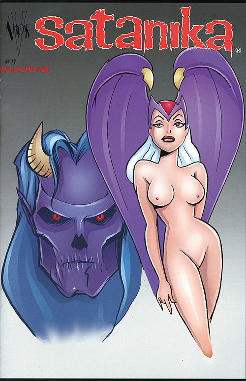
Cover Review: Satanika #11

I've never been a fan of this series, but I have usually enjoyed the covers.  This one, for issue eleven, is, quite simply, boring.

Jason Blood is the artist, and his artwork here looks like something you would find in his high school chemistry notebook.  It tells you nothing about the comic, the character or the story, and nothing screams, "Read me!"  In fact, the only new reader I can see picking this up is the one who is interested in naked demon chicks.

Unfortunately, the naked demon chick pictured here lacks any kind of erotic appeal, and she sure as hell doesn't appear to be "evil."  The guy behind her looks a little more threatening ... in a He-Man villain sort of way.

I've seen more of Blood's artwork and remain unimpressed by what I've witnessed.  This cover being no exception.  Lackluster in art style and even color, it summons not demons, but boredom.

Saturday, May 29, 2010

Cover Review: The Eternals #14

Jack Kirby strikes again!  For a man I didn't appreciate as a kid (mainly because his art freaked me out), I definitely appreciate him now.  This is not, obviously, his best cover, but it works.

The Eternals was a weird series, and I never picked it up, but seeing the Hulk on the cover would have caused a curious Hulk fan to at least page through this.  It also has all the Kirby standards, which definitely doesn't hurt.

The first thing that catches the eye is the imposing figure of a red-clad man flying off the cover courtesy of the Hulk.  A cover that shows off action like this begs to be investigated regardless of whether or not you know who the characters are.  There are no word balloons.  There is a cover blurb, however, which pretty much details the cover with one exception -- this is a "cosmic powered" Hulk.  Attention grabbed; curiosity peaked.  Mission accomplished.

Cover artists of today could take more than a few lessons from Kirby.  He did every cover as if his career depended on it.  You can argue about whether they all worked, but you can't argue with the creativity put into them.  He knew what worked, and used it.  Perhaps if more artists followed his lead sales would be better these days.  Then again, Kirby was one of a kind ...

Saturday, January 23, 2010

Cover Review: ACG's Halloween Horror

You have to hand it to ACG: This cover is creepy.

ACG's Halloween Horror
came out in 1998, though this cover reminds me of something from the late 1960s or '70s. The witch-like person, possible Klansmen, and a cowering captive/cave dweller/hobo practically demand you read this issue. Hell, if I would've have seen it on the rack I would have got it instead of whatever other garbage I was reading at the time.

As most of my readers and friends (not a big crossover group) know, I'm a big horror fan. Horror comics are part of that. Essential to the horror comic reading experience is the cover. Most of my cover reviews rip apart a cover for failing to do its job (get a reader to pick up the issue). ACG hits it out of the ballpark here. This cover is, quite frankly, disturbing. Though it looks like an old block print, the inclusion of the Klan-like element makes it a bit more modern, but also lends it a hint of discomfort (much like that infamous EC cover). I don't know if the Klan is involved in the story, but the picture is enough to case the association.

Brilliant.

Friday, December 25, 2009

Cover Review: The Rifleman #10

Oh shit, what can't you say about this cover? I mean, it speaks for itself. It's the kind of thing NAMBLA members go ape shit over. Granted, I'm sure it was an innocent mistake. The Rifleman is a wholesome comic. It was made to appeal to young boys ... and apparently work as a recruiting tool for aging homosexual cowboys. "You see, son, how that boy is holding that log? Let me show you how I want my wood handled."

Where were the concerned parents over this one? Screw EC. This stuff is scary. The only thing that could make it worse is if the kid had milkshake residue dripping down his chin and the cover blurb said, "Holding this log sure made me thirsty, but I'm satisfied now!"

And just what is this "mysterious bag" that holds a "secret"? Jesus, one guess to that one. "That, son, that's my man bag." The threat isn't the bag, either. It's the log in this kid's hands and the knowing smile from Mr. Connors. I guess if I were into young boys I'd be pretty happy about this, too.

What did kids at the time think when they saw this cover? Did pedophiles see the title and cover and think, "Finally! A comic for me!"? Did any fans of the comic question this? I've got plenty of questions myself, and I've never read the damn thing. My main question is: Whatever happened to that boy?

Yeah, this cover is a failure ... unless it was going for the creepy child molester crowd. If that is the case -- job well done, Dell.

Tuesday, November 17, 2009

Cover Review: The Elongated Man #3


What does it say about a mini-series when your title character is in the background? To me it says, "lack of confidence." The fact that the cover, like all the covers in this series, is done as a mock postcard, too, which can work every once in a while, but for all four issues? No.

The Elongated Man has always been a pointless DC character. Not much has made him stand out (though Identity Crisis made him tolerable). This cover is part of that problem. Nothing about it screams "must read" or even "fun." Yeah, it looks like it might be amusing, but also that it is instantly forgettable and not very important in the grand scheme of things. The pun, "From Bad to Wurst," is also a groaner -- again like the character.

All four issues of this series had covers that failed to catch anyone's attention. If you are one of three Elongated Man fans, you probably were overwhelmed at the possibilities of this series, and probably also really enjoyed the covers. You may also enjoy watching paint dry and old sitcoms on TV Land.

The rest of us are left wishing this character would have never been created in the first place.

Sunday, October 4, 2009

Cover Review: Daredevil #36


I'm a huge fan of the Daredevil character. No secret there. The above issue is #36 in his original Marvel series. As you can see, twelve cents was it all it took for about twenty minutes of entertainment. My how times have changed.

This is a mediocre Daredevil cover, and this series had plenty of those. Gene Colan, an artist I've never really liked because he makes everyone look a little deformed, did the pencils and Paul Reinman went crazy on the inks. The result is a cover that could've been really good, but instead looks unkempt.

The use of the single light to spotlight the unconscious Daredevil is a great touch. Looking at the man's face who is holding him, however, gives the reader the sense this guy just came across our hero. He doesn't look like the type who could take down the Man Without Fear. In fact, he looks a little mentally disabled. If that was supposed to give readers a sense of danger, it didn't work. If it was to get us to question what was going on -- mission accomplished.

"The name of the game is ... MAYHEM!" reads the cover blurb. Is mayhem what is going on, or is it the name of the man who is holding Daredevil's limp body? Good questions again, and one can only hope the former is true because this guy looks to be light years away from Mayhem. Maybe it's that goofy outfit which makes him look like he should be a figure on a futuristic playing card from Bicycle. ("I got the Joker, and he's wild!") It leads to questions, and since I think Daredevil readers tend to demand a little more from their comic book stories, this is a good thing.

With all respect to Colan, too, this is one of his more reserved works. Nobody's collar is flying out of control, no coats are whipping around, lips aren't distorted, no hair is askew. Daredevil's limp, outstretched hand seems to be pleading for our help, too, which is a great ploy on Colan's behalf. It gives the reader a stake in the outcome of the tale. Regular readers can't help put to pick it up. First time readers may just be curious enough to see what is going on. It will not, however, attract a reader who has never had a desire to read the title before.

This isn't the worst Daredevil cover ever done. Nor is it the best. It kind of matches what often happens with this title. When it's good, it's really good. Otherwise, it just tends to sit there until a capable writer (like Frank Miller, Brian Michael Bendis or Ed Brubaker) comes along.

Thursday, September 10, 2009

Cover Review: Defenders #51


For some strange reason I remember The Defenders as having plenty of "floating head" issues. As you can see, this is no exception.

I am a fan of this comic book. I've always like the title in its original form, even though I never thought the characters were the greatest. They just seemed to work well together. Hellcat is my favorite on this cover. Nighthawk, who is being tormented by the Ringer, seems weak. I don't care how many rings there are or who is causing them to float -- rings are weak, and that is not a good way to sell a superhero comic. It's also the reason the Hulk isn't pictured in the rings. (Doctor Strange may have been a good choice because he's a cowardly magician no matter how you cut it. Those gloves! That mustache! Wong!)

To someone unfamiliar with the concept of the book or the heroes therein, they may be fooled into thinking Hellcat and company are gods looking down on the Blue Falcon's brother as he is killed by an American Gladiator. Unfortunately, that is not the comic book here. This actually just screams, "Boredom!" Imagine how that conversation by the comic rack went. "Cool! Look at this issue of The Defenders!"

"Who's the villain?"

"The Ringer."

"Who?"

"The Ringer."

"What's he do?"

"I don't know. Control rings."

"Star Wars out yet?"

This title had far better covers and far better villains. (Elf with gun!) This cover is a failure of Hulk-like proportions.

Monday, August 10, 2009

Cover Review: Domination Factor -- Fantastic Four #2.3


Wow. Just the awkward title of this issue makes me want to stay away from it. (And what the hell is up with the numbering system? Decimal points do not make for a fun comic book experience.) Why would I want to read it? Maybe because I'm a fan of the Fantastic Four? Maybe because I was collecting this series? Well, if I wasn't collecting it, I wouldn't want to buy it. If I was, however, a fan of the FF, the fact that the Human Torch was turning tail would not do wonders to my excitement factor. It just seems unlikely, so that's not fooling anyone.

The cover itself looks to be one of those that was inspired by Jack Kirby. Mr. Fantastic is wrapped around the monster so much that it actually looks like he is its outfit. That's just creepy, and the art just isn't dynamic. What is the Thing actually doing? Is he going to pummel someone? It looks as if he isn't even trying.

I will say that I like the word balloon, though. I miss those on covers. I just wish this said something better, something more believable. Perhaps, "Take off, Johnny, and bring back reinforcements! We can't take this beast down alone!" That would at least seem plausible.

Truly a crappy title and cover. What was Marvel thinking?

Friday, July 17, 2009

Cover Review: Uncanny X-Men #258 Marvel Legends Reprint


I imagine if you're already buying a Marvel Legends toy you are familiar with the X-Men. This cover would not make me a fan, however.

Psylocke is featured. You either love her or hate her. This image doesn't really portray her as the bad ass she can be. Instead, it's a little overly sexualized (which is something she always was), but also makes the comic seem like it's meant to appeal either to boys who haven't had the courage to talk to girls yet, or girls with power fantasies. Nothing wrong with either, but it doesn't represent the X-Men.

The background images fade into the background and if you stop looking at the cover for more than sixty seconds you end up forgetting about them. You do remember that "Not for Resale" blurb, as it breaks up the overall theme of the piece, but is apparently necessary (and often ignored).

Uncanny X-Men
have had some terrific covers. Many are iconic and are featured on many top cover lists. This will never make those lists as it is as forgettable as it is boring.

Sunday, May 24, 2009

Cover Review: Blowjob #10


This cover is one of the better Blowjob covers. While the comic series was full of hit or miss moments,the covers were mostly misses. This one, however, stands out, and it does so because of what it doesn't show.

Most comic book stores would not put this comic out in the open, so the covers weren't necessarily used to draw readers, and the publisher, Eros, had to know that. Therefore the covers should have been artistic. Most of them were just plain bad and weren't all that graphic. (It was almost as if the publisher was afraid to be graphic on the cover.) While they weren't graphic, they were suggestive. This one is suggestive in all the right ways.

First of all, this cover puts the viewer in the role of the guy getting the hummer. That's always a good position to be in no matter what you are doing. And while the thong is tasteful, I could do without the blond hair (just my personal preference). The cover says a lot. Any guy would know what is going on without seeing the comic's title. The title, however, when mixed with the cover art lets the reader know exactly what kind of stories they are going to get.

Other covers in the comic series had females with milk splashed on them, glory hole shots (which was one of the most terrifying covers on a comic I have ever seen), and generally juvenile moments. This one stands out because it is tasteful, subtle (for the series) and erotic. In fact, I'd bet most females wouldn't have a problem with this cover, either, as it is erotically done.

Saturday, May 16, 2009

Cover Review: Alpha Flight #110


One word comes to mind when looking at this 1992 cover: typical. Typical bland art and typical bland team shot. Everyone has a glint of evil, which is fine, but all the evil comes out in their eyes because all the eyes pretty much look the same.

I dislike boring covers. This cover would never get me to pick up the book. Alpha Flight was never a favorite of mine, and this cover would not have changed anything. Did anyone pick up this book because of the cover? Does it tell you anything about what is going on inside? What makes it stand out on the stand? Nothing. The colors are unappealing, the characters generic. And in 1992 every other cover had the same vibe, same art style. While it house an excellent story, the art tells potential readers to stay away unless they want more of the same.

Back when this series first started, the covers were something that were talked about. Remember the one that was almost all white? The one with all the rods? The one with Wolverine about to go nuts? Those were good covers, exciting covers. They were covers that made you want to at least look inside the issue. This cover does the exact opposite. By all accounts, the series was horrible at this time, and this cover presents no hope for the story inside. Pat Broderick was the artist behind it. The art lover in me says he should be shot. The comic fan in me thinks he should have been banned from ever doing another cover. The human in me wishes he would have picked another career. I wonder what he is doing now?

I hope it's not working on any new covers.