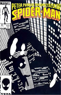
The covers for this series were typically full of action and usually centered on Spider-Man and whatever villain he faced that issued. This cover goes the more artistic route, and in doing so may have attracted more glances than the other titles surrounding it on the rack at the time.
The year was 1985, and John Byrne was the cover artist. This is obviously before his artistry went totally south.
If you're looking at the cover trying to figure out what doesn't look quite right, you wouldn't be alone. At first you are taken in by the excellent lack of color, but the more you stare at it the more something seems off. It's the buildings, and it's brilliant.
The layout of the buildings makes no rational sense. If this were a photograph, it would be doctored, as there is no place where buildings would be laid out like this. It's almost reminiscent of Germany's own Expressionist masterpiece The Cabinet of Dr. Caligari.
Byrne wasn't going for realism. Here he was using pure art. He was playing with the standard poses readers were used to seeing Spider-Man in, and then he used the black costume and made something that could easily grace a museum's wall. Imagine if he had done the same thing in red and blue using Spider-Man's standard costume. It would not have worked.
I've given Byrne plenty of flack in my writing, but I will admit that with this cover he shines. Would it have made me pick up the book to read? No, but it would've caught my eye, and it still does. In a series that had few truly memorable covers or moments, this one stands out, and it's all due to Byrne.
No comments:
Post a Comment